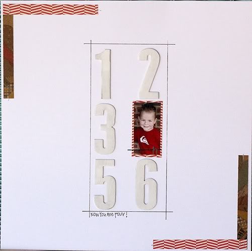
I saw a page on Pinterest that had white on white. There were letters and a small photo. As soon as I saw it -- I had an idea. I knew I could take this idea and adapt it to fit my needs and my style.
I replaced the 4 with Harrison's 4 year photo. I stayed with the white theme, but I added the strips and the drawn in corners. This page was much more minimal than the original and I LOVE IT!


Love the simplicity of this Jennie!
ReplyDeleteI love the white on white! I think I will need to lift this soon!!! =)
ReplyDeleteThis is fantastic!!! I love minimalist pages- this is going right on my pinboard! It jumped right out at me when I saw it over at Paper Issues as well. The photos taking place of the year is such a great visual!!
ReplyDelete